Media Strategy
Publicize Your News
We help share news of your work and achievements, and connect faculty experts with reporters who can get their work in outlets across the globe.

The Medium and the Message
Marketing and Communications is responsible for elevating Clark’s standing and reputation as a global university of consequence — in undergraduate and graduate education, transformative research, and community partnerships — with prospective students, alumni, educators, public and private leaders, media, employers, and foundations.
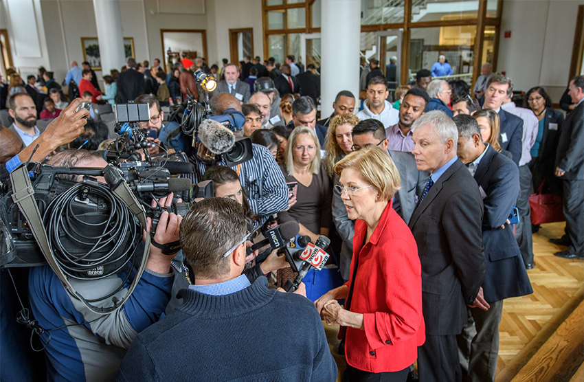
We help share news of your work and achievements, and connect faculty experts with reporters who can get their work in outlets across the globe.
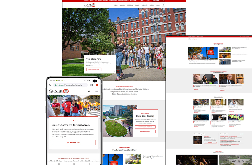
We work with you to develop a web content strategy and design for your department or office web pages, and help you establish a presence on the social media platforms that best suit your needs.
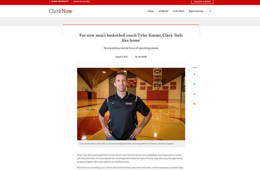
Whether it’s cutting-edge faculty research and awards, innovative programs and initiatives, or catching up with our notable alumni, we write stories and features for a range of platforms, including ClarkNow and Clark magazine.
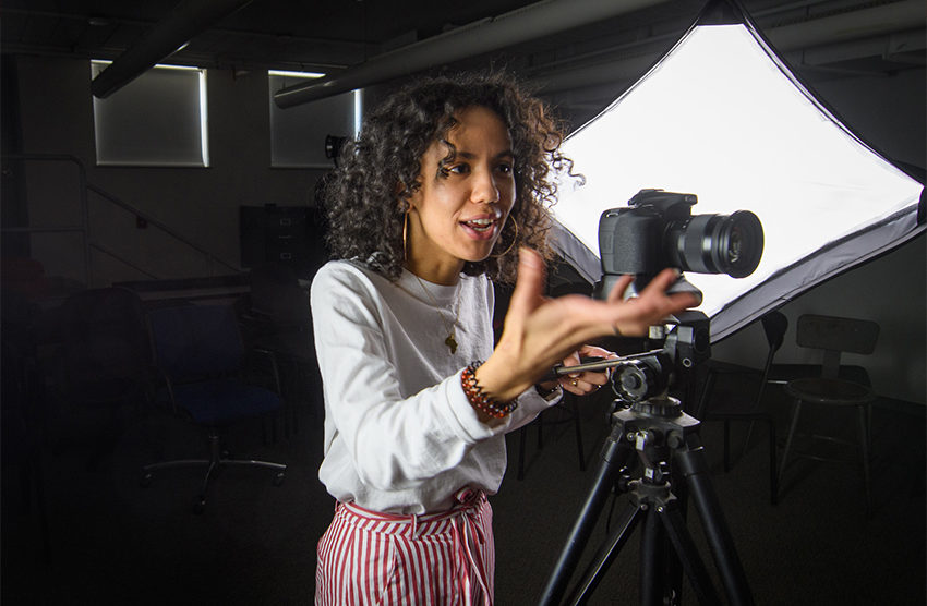
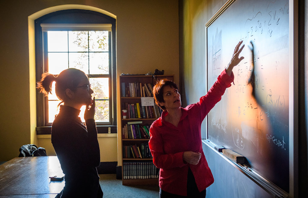
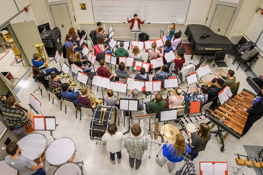
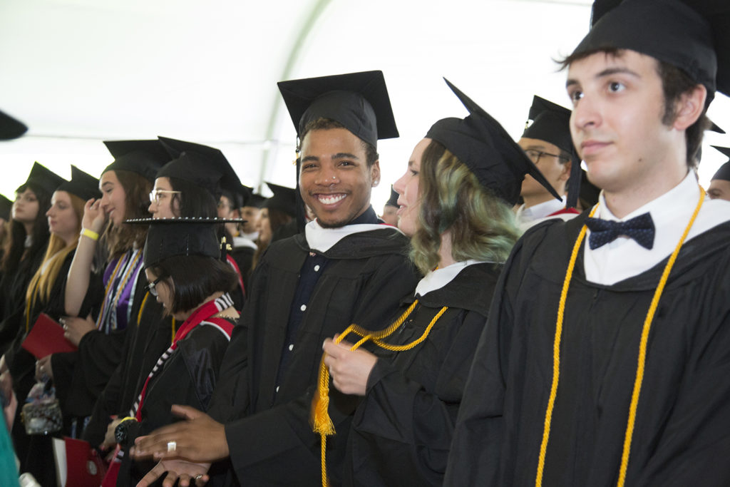
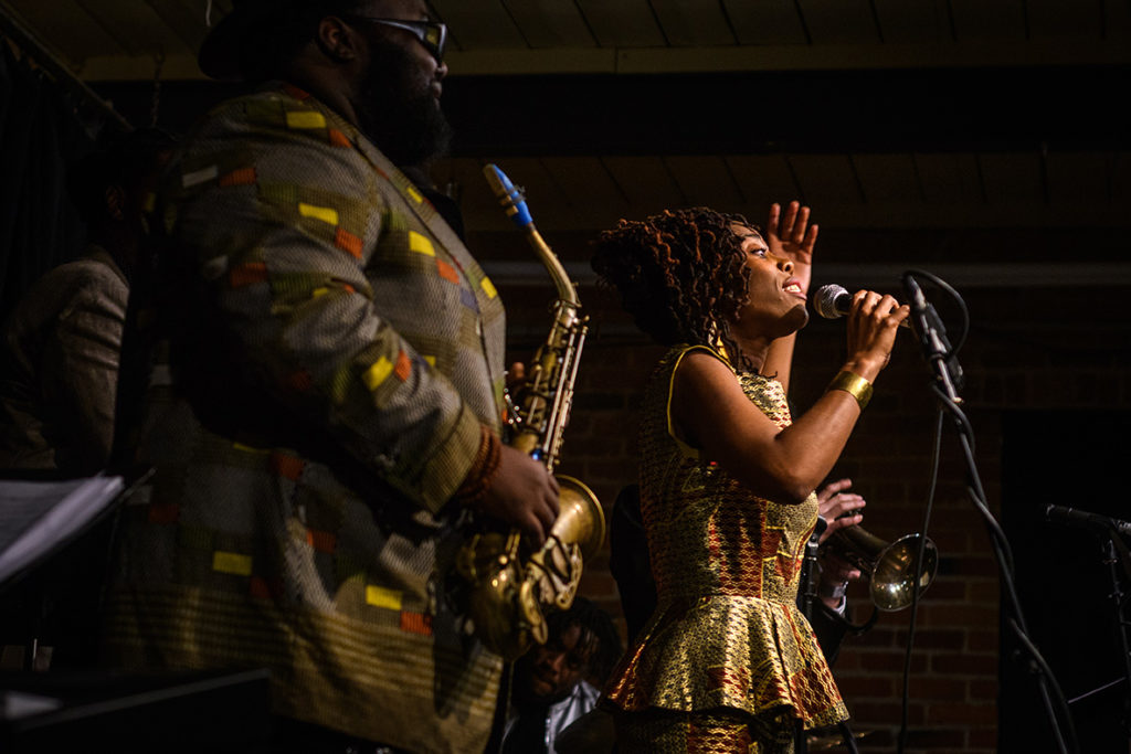
To engage audiences and tell stories, our photographers and videographers capture the Clark community at work and at play.
Our Brand Identity Style Guide includes approved logos, colors, and other visual design elements. We also can coordinate the design of a range of print materials, from posters to annual reports, postcards — even apparel embroidery.
138 Woodland Street
Main Office, Room 207
Worcester, MA 01610